Mobile app that focus on delivering a clean user experience, providing personalized recommendations, offering motivating features like progress tracking, and regularly updating content to address evolving skincare needs. The lack of skincare knowledge, overwhelming product options, inconsistent routines for specific skin concerns, and the need for tracking and progress monitoring.
Aimed to revitalize the digital presence of their web platform and extend the cohesive visual experience to the Apple Store and Google Play Store platforms. The focus of the project was a comprehensive refresh of visual assets, ensuring a harmonious and modern representation across all touchpoints.
Role
UI/UX designer
Tools
Figma
Illustrator
Time
4 Weeks
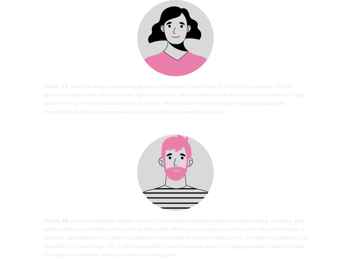
User Persona
Branding
This color palette combines soft pinks, lavender as principals to create a sensitive and feminine atmosphere that aligns with the skincare app's desired aesthetic with the use of green and blue for some contrast. And for the tipography, the font “mermaid” for titles and subtitles, and the family “poppins” for paragraphs.

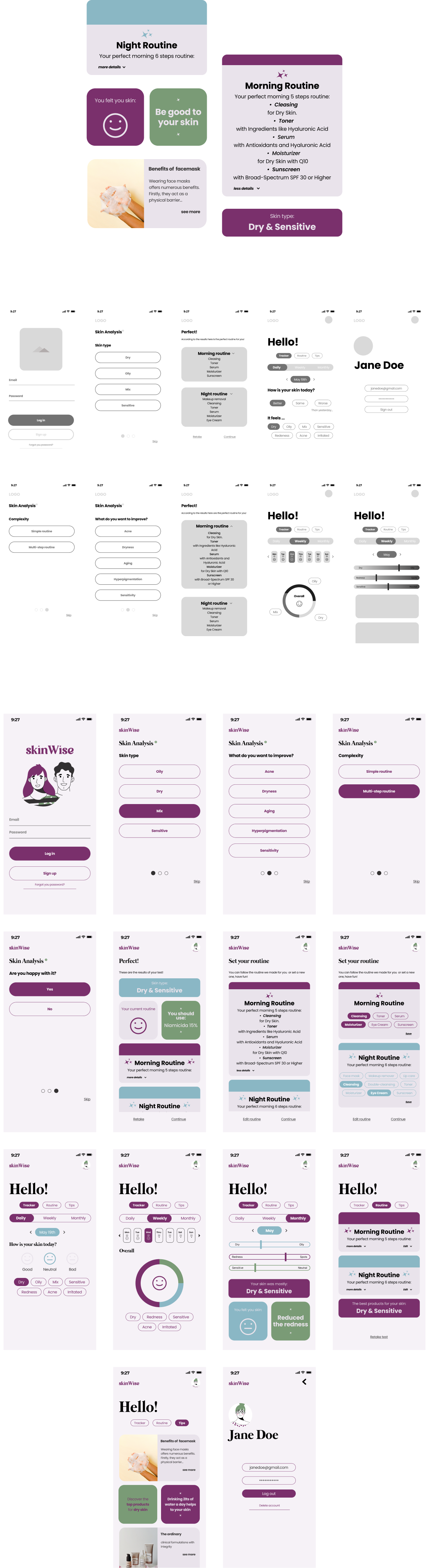
Cards & Wireframes